script開發於Centos 7,其它版本可能因為top或free版本的不同而有些格式上的差異,微調awk抓取欄位可以解決。
首先用一shell script從top、free等linux內建指令抓取系統效能資料
#!/bin/bash


#define profile

this_mon=`date +%Y%m`
LOG_DEST=/root/perfcollect_${this_mon}.log

#statistic data fetch part
date_time=$(date +"%m/%d/%Y %H:%M:%S")
cpu_count=$(top -b -n 2 -d 1 | grep "Cpu(s)" |tail -n 1 | awk '{gsub(/\%us\,/,"",$2);print $2}')
os_count=$(top -b -n 1 |awk 'NR == 1{gsub(/\,/,"",$(NF-2));print $(NF-2)}NR == 2{print $4 " " $2}')
ram_count=$(free -m |awk 'NR == 2 {print $3 " " $4}NR == 3 {print $3 " " $4}')
#print result part

if [ -e $LOG_DEST ];then
 printf "%-11s %-9s %-4s %-5s %-5s %-5s %-7s %-7s %-7s %-7s \n" $date_time $cpu_count $os_count $ram_count >> $LOG_DEST
else
 printf "%-20s %-4s %-5s %-11s %-15s %-15s \n" log cpu avg process 'memory(MB)' 'swap(MB)' > $LOG_DEST
 printf "%-20s %-4s %-5s %-5s %-5s %-7s %-7s %-7s %-7s \n" time '(%)' loads run total used free used free >> $LOG_DEST
 echo -e "----------------------------------------------------------------------------------------------------------" >> $LOG_DEST
fi
這邊特別留意的是,特別從top第二次顯示的資訊擷取CPU%的值,否則top第一次顯示%Cpu(s):值是自系統啟動以來的平均值。
執行出來的效果是這樣,不是很難的script,但對齊很辛苦…(實際顯示較整齊,這邊順便抓取了mysql的session數)
log mysql cpu avg process memory(MB) swap(MB)
time session (%) loads run total used free used free
----------------------------------------------------------------------------------------------------------
2017-03-17 18:40:01 3 0.0 0.05 1 167 1147 14799 0 2047
2017-03-17 18:45:01 4 1.0 0.02 1 167 1146 14799 0 2047
2017-03-17 18:50:01 3 0.0 0.01 1 168 1146 14799 0 2047
2017-03-17 18:55:01 3 0.2 0.00 1 168 1146 14799 0 2047
2017-03-17 19:00:01 4 3.2 0.00 1 168 1147 14798 0 2047
2017-03-17 19:05:01 4 0.2 0.39 1 169 1147 14799 0 2047
2017-03-17 19:10:01 3 0.2 0.00 1 168 1146 14799 0 2047
2017-03-17 19:15:01 3 0.0 0.00 1 168 1146 14799 0 2047
2017-03-17 19:20:01 4 2.2 0.00 1 168 1146 14799 0 2047
2017-03-17 19:25:01 3 0.0 0.01 1 167 1145 14800 0 2047
2017-03-17 19:30:01 3 0.0 0.00 1 168 1146 14799 0 2047
2017-03-17 19:35:01 3 0.0 0.00 1 168 1146 14799 0 2047
2017-03-17 19:40:01 3 0.0 0.00 1 168 1146 14799 0 2047
2017-03-17 19:45:01 3 2.1 0.00 1 168 1146 14799 0 2047
2017-03-17 19:50:01 3 0.0 0.00 1 168 1146 14799 0 2047
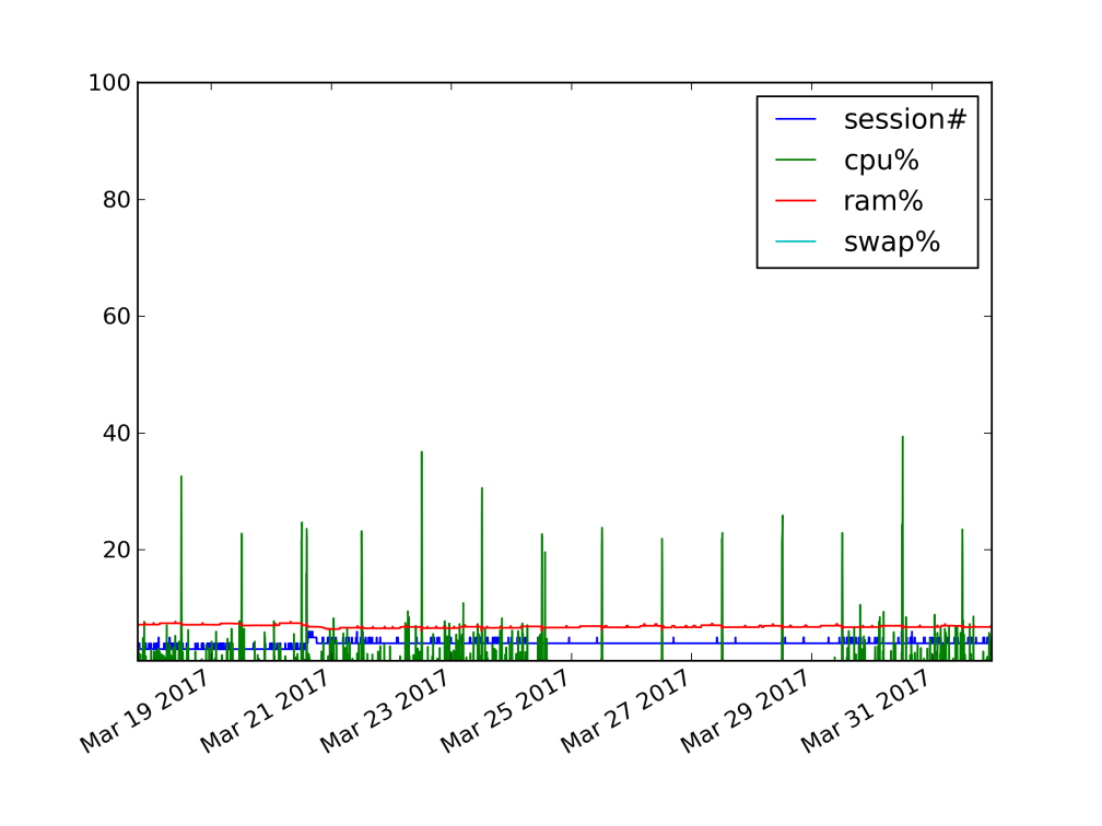
基於上述的log file,使用python(2.7.5)的matplotlib模組將這些資料轉成圖表
#!/usr/bin/env python
import matplotlib
matplotlib.use('Agg')
import matplotlib.pyplot as plt
import numpy as np
import datetime as dt
import sys

def dic_logline (line):
 split_line=line.split()
 datetime=split_line[0]+' '+split_line[1]
 db_session=split_line[2]
 cpu_usage=split_line[3]
 mem_usage=float(split_line[7])/(float(split_line[7])+float(split_line[8]))*100
 swa_usage=float(split_line[9])/(float(split_line[9])+float(split_line[10]))*100
 return (datetime,db_session,cpu_usage,mem_usage,swa_usage)

def gen_log_rpt(logfile):
 line_dect=[]
 for line in logfile.readlines()[3:]:
 try:
 line_dect.append( dic_logline ( line ) )
 except IndexError:
 continue
 nt=tuple(line_dect)
 lst1,lst2,lst3,lst4,lst5=zip(*nt)
 return [list(lst1),list(lst2),list(lst3),list(lst4),list(lst5)]

def main():
 inf=sys.argv[1]
 infile = open(inf,'r')
 log_report = gen_log_rpt(infile)
 dates = [dt.datetime.strptime(d,'%Y-%m-%d %H:%M:%S') for d in log_report[0]]
 fig,ax1=plt.subplots()
 ax1.plot(dates,log_report[1],label="session#")
 ax1.plot(dates,log_report[2],label="cpu%")
 ax1.plot(dates,log_report[3],label="ram%")
 ax1.plot(dates,log_report[4],label="swap%")
 plt.ylim(1,100)
 plt.legend()
 fig.autofmt_xdate()
 plt.savefig(inf+'2fig.png',dpi=300,format="png")

if __name__ == "__main__":
 main()
基本上就是從log file把一筆筆的紀錄讀出且split成各個list,再把list傳入plot輸出;最後將logfile當作參數傳入python程式圖片就出來拉~
./log2fig.py perfcollect_201703.log
程式新手,相信有更好寫法,而且系統效能資料擷取的部份可能用python寫會更方便且整合。
